I guess because I’ve been thinking about Early Printed Fun as a series of letters that show up in your inbox, I felt like I should have some sort of sign-off for them. “Mind your p’s and q’s!” I wrote in my last letter, and some of you probably got the idiomatic meaning of “be on your best behavior/pay attention to finicky details!” A few of you would have also nodded and said, “ahh, nice type compositor joke” and I would like to thank you for that.
The lowercase “p” and “q” are of course mirror images of each other (well, depending on your typeface; some give a little curly tail to the “q”, maybe to make it easier to differentiate from the “p”). That makes them easy to confuse in the best of circumstances. But imagine holding them as pieces of type, the faces of which read backwards so that what they print reads forwards. Think of rubber stamps: they are the mirror image of what they print. Or look at this nice demonstration from the Encylopédie (image from the Smithsonian on Internet Archive):

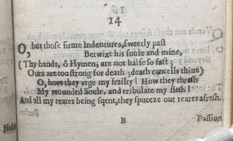
Even better, let’s look at this amazing poem by Francis Quarles to his friend John Wheeler, printed in London in 1637 (pic snapped by me of Folger STC 20537):

Isn’t that amazing? “And all my teares being squent, they spueeze out teares afresh.” Poor lad, wounded in soul and print. I don’t know how many copies have this error or if it was ever noticed or corrected, but it’s definitely in the Folger copy and the British Library copy (G.960.(1), which is where Dianne Mitchell noticed it and tweeted it out, bringing it to my attention).
It’s easy to assume that the printer mixed up the two letters while he was setting the type, but I think it’s worth asking that question more carefully. When, exactly, in the printing process did the mistake occur? It seems too much to me to assume that it results from two separate instances of type being distributed back to the wrong boxes—that there was a “p” in the “q” box and a “q” in the “p” box and that the compositor just happened to pick up both of them without noticing.
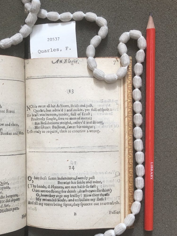
My bet is that at some point in setting up this page, the type pied (that is, that it spilled and got jumbled up). If you look at the whole page, you can see that the line with the mistake in it is longer than the other lines of the poem (and that the whole thing is relatively small):

I can easily imagine trying to squeeze that line in to the available space and accidentally jumbling the whole thing when there isn’t enough room. If that happened, the compositor would then have to reset the line from the type that pied, and it would be super easy to pick up and place the tiny “p” and “q” in the wrong place. Tears squent and spueezed indeed.
It’s a perfect error, really, for our purposes, seeming to illustrate exactly the kind of material process that lives on not only in the printed text but in the skeuomorphic language we use today.
Alas, when I did a bit more poking around, it seems that there is not a consensus on where the phrase “mind your p’s and q’s” comes from. Maybe it’s from setting type! But maybe not! Here’s some of what the Oxford English Dictionary has to say on the matter:
A common suggestion is that the phrase referred originally to the difficulty which a child beginning to read has in distinguishing the lower-case letters p and q (or alternatively, the difficulty encountered by a typesetter, who will have to recognize these letters back to front); compare e.g. quot. 1763 at sense 3. However, the chronology of the senses would argue against this, and no such connotation is evident in the earliest quotations. ("P's and Q's, n.". OED Online. September 2019)
How disappointing is that? I guess life, like printing, doesn’t always turn out as neatly perfect as you hope it will. Sigh. Still, you can learn something new everyday, especially if it comes from someone else’s error!
thanks and see you soon!
Thanks to all of you for signing up for Early Printed Fun. I hope you’re having some fun reading it. I certainly am enjoying writing it! I’ll confess I haven’t quite settled on how often I want to be sending this out. Every other week is where I am at the moment, I guess. This letter is only going to those of you reading the newsletter, unlike the last one, which was repurposed as “featured content” on EarlyPrintedBooks.com. If you’ve got strong thoughts about this, or other aspects of the newsletter, you can email me at sarah@earlyprintedbooks.com.
One other note: If the last issue’s look at digitized copies of early books got you excited about looking at as many digital facsimiles as possible, you’re the perfect person to enjoy my updated list of early modern digital collections. It currently lists 23 libraries with strong holdings of early modern printed books that are made available as public domain images or under an attribution or share-alike license. So much to browse and to reuse freely!
Until next time, mind those p’s and q’s, even if you don’t know why!
Sarah.
