Although the primary purpose of EarlyPrintedBooks.com and Early Printed Fun is to look at early printed material, by the very nature of the digital transmission of these platforms, we can only look at instances of this things by translating them into digital media. And I do mean translating! We tend to look at images of books as if they are transparently faithful representations of the book itself—as if we are looking through the digital medium and straight at the printed matter. But of course we aren’t. And one of the fun things about how I’ve put together EarlyPrintedBooks.com is my decision to leave all the images as they were when downloaded from the platforms I’ve gathered them from.
Here’s an image I added recently, a page from a 1618 Dutch version of Dodoens’s herbal as imaged by the Hendrik Conscience Heritage Library:

It’s not particularly weird at first glance, but it’s also not the way we encounter many images of early books, which often show us only the page itself, trimmed tightly to its edges, cropping out any fore-edges of the volume, or bits of binding, or certainly any background. Let’s look at how the Getty Research Institute’s copy of the 1568 Dodoens herbal is shown on the Internet Archive, for instance:

First, yes, that is the same illustration as in the first image; not only that, you can find other books printed from the same woodblock—and that woodblock itself!!!—over on EarlyPrintedBooks.com proper. But my main point here is that this page appears as a flat, edgeless object: it’s trimmed so that there are no fore-edges visible, let alone a background of supporting material or a target color card or ruler.
I suspect that for most viewers of digital facsimiles of early printed texts, those absences aren’t even noticeable until you start seeing counter-examples. We have become accustomed to seeing facsimiles of pages as if they are just free-floating rectangles, rather than digitization of material objects. Why do we do that? (Quick guesses: we had customers who valued text, we formed imaging habits when bytes and bandwidth were scarce resources.) What does it mean for us to image works in ways that prioritize the text or illustration rather than the book or paper itself? (That’s more complicated, and I’m not even going to try to sum up my thoughts in a parenthetical here, sorry.)
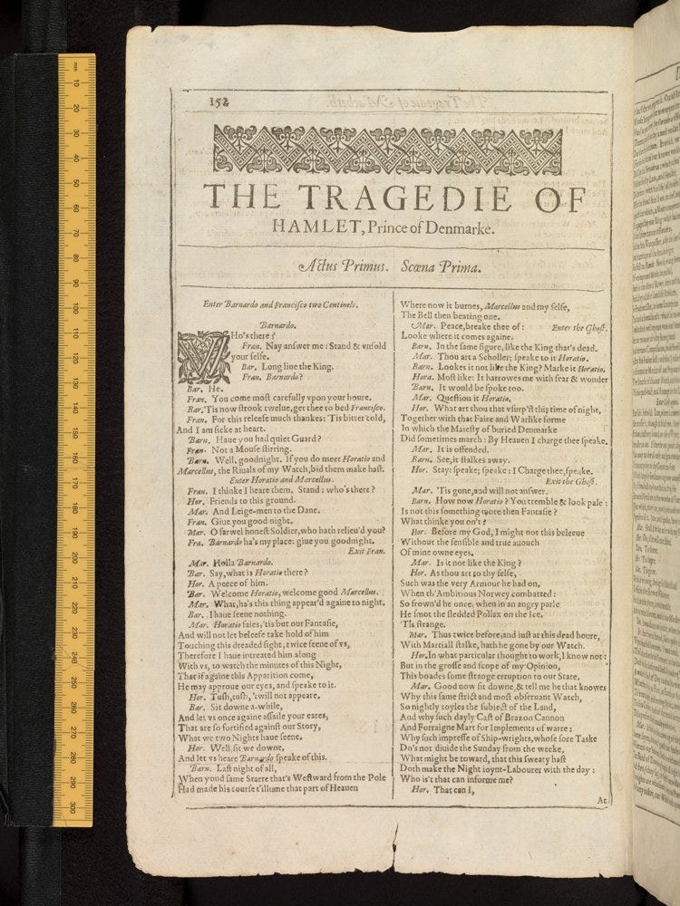
Different institutions make different choices in sharing images from their collections. The Bodleian, at least in recent years (standards change, of course) tends to include edges, backgrounds, and rulers, as in this from their imaging of Shakespeare’s First Folio:

Rulers are super handy because digital images otherwise make pages or openings look as large as the screen displaying them. I mean, look at the first two images in this newsletter. If you didn’t know that it was the same block printing both corn-cockles, would you guess that the second page was about a quarter of the size of the first?
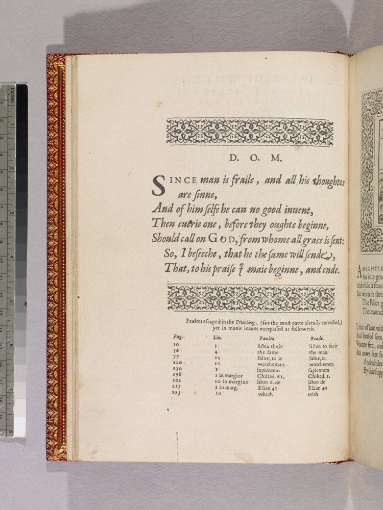
I’m fond of how the Huntington Library has imaged this book, Whitney’s 1586 A choice of emblemes, in part because the ruler they use to indicate size also includes a grey scale target, making it easier to tell what the tone and darkness of the image should be, since screens can affect not only how size is displayed, but how color is as well. But what I really love about this image is that the weird shadows show another aspect of images that we don’t often think about: lighting is one of the key staging and reshaping tools used in imaging, used to eliminate or highlight a page’s natural topography.

Finally, let’s look again at that edgeless Getty Dodoens. I don’t love it, as you might guess. But I also deliberately chose it over of the other option I had:

There is nothing wrong with this image! I could have used it! This is part of the .tar file that IA refers to as the “original jp2” images. Those unprocessed images can be a lot of fun to look through. You can see the different stands and mattes used, sometimes you get fingers in there, or glimpses of a spine. But often the amount of background that appears in the image reduces the part of the image that includes the textual object—and since I’ve set my templates to display images at fixed sizes, that could end up meaning you are squinting at the images in the archives displays to try to figure out if you want to click on them.
So that’s it. Every image of an object is a translation, even one that purports to be an exact copy and even one that is selected for you by someone who purports to care about these issues. And every translation includes choices made by someone else on your behalf, whether you wanted those choices or not.
Some notes:
All the images I used in this newsletter are included in EarlyPrintedBooks.com and the links will take you to their pages. There you can find out a bit more information about those objects and follow tags to other images or browse or search randomly across the entire site.
If you don’t know how to download single images from Internet Archive, rather than downloading the entire book, you can learn more by following the instructions on my digital collections page at Wynken de Worde. It’s super easy and I am so grateful to whoever the person was at the Smithsonian who wrote up the information because it has saved me pulling my hair out on more than a handful of a handful of occasions.
Thanks and see you soon!
Thanks to you all for having faith that this would be worth signing up for before I’d even put out the first issue. I hope I’ve repaid your optimism and you found some fun here, even though I did kind of pull a fast one and wrote about looking at images of books instead of looking at books. Next time, something actually early modern, I promise!
I’m going to be posting this on EarlyPrintedBooks.com in a couple of days (minus this postscript) because I want there to be some sort of story that can lure people into the site. I really believe in the value of a narrative to get people hooked on anything, and I want to create a “featured book” page that I’ll update every couple of months. Those posts will also come out as free newsletters, and all of those posts will then be archived over here, at the Early Printed Fun online home.
But Early Printed Fun (EPF??) will have additional letters that won’t appear on the website, and the next few will be those. I’m not sure what I’ll be writing about yet. But I miss writing about old books, and I’m looking forward to sharing tidbits with you! Down the line I’m hoping to add in subscriptions as a way of helping to support all this, but we’re not there yet, and I’ll give you lots of notice and explanations before we get there.
In the meantime, mind your p’s and q’s!
Sarah.
